Assembled
Assembled-
A group of objects, items and products gathered together.
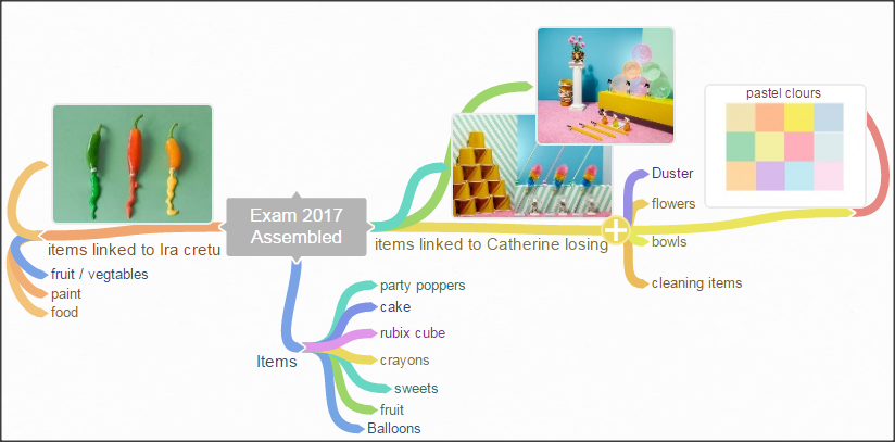
Catherine Losing-
Catherine Losing is a still-life photographer and director. Her work takes inspiration from the everyday and makes it extraordinary with a unique style and subtle humour.
Catherine Losing's work-

Favorite picture- |
Least favorite picture- |


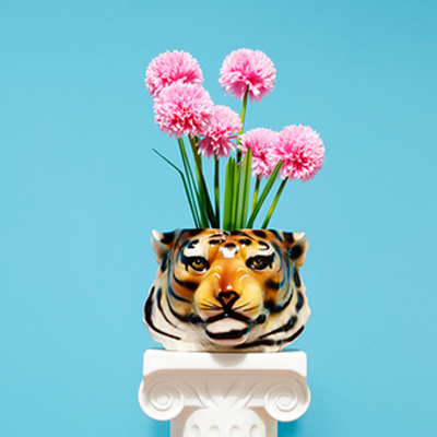
I like this piece because the bold colours from the tiger vase allow's the colours to clash. Also the reflection on the vase gives the photograph an interesting look.
I think the meaning of this piece is the combination of the wild and everyday items because I can see a tiger vase and flowers representing both everyday items and the wild. This is an effective image because they have used the camera settings effectively. It looks as if she may have used the white balance because the appears to be more a white lighting than yellow. Also the focus point is on the the center of photo ( flowers, vase, white stand). Also the shiny texture of the vase and the smooth sleek background compliment each other well. |

This is my least favourite picture because personally I feel that the image doesn't represent ' assembled '. However the one thing I did like about this image is the pastel colours and the contrast on the glass gives the image a nice touch.
|
Ira Garber-
Ira Garber is a commercial photographer who uses pastel and muted everday objects to create her colour palates within her
photographs. These photographs are used in advertisements to magazines.
photographs. These photographs are used in advertisements to magazines.
Ira Garber's work-

|

|

|
Favorite picture- |
Least favorite picture- |

|

|
|
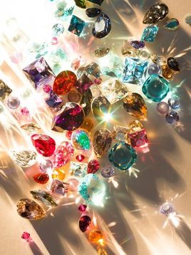
I like this piece because the reflection from the jewels give this photo an interesting look because each jewel has its own unique color and reflection.
When I look at this piece think about money and wealth because of the jewls and the way that they are arranged to give of a shadow and reflection. This is an effective image because they have used the camera settings effectively. They may have used a narrower aperture so less light comes in so you can see the shadows more effectively. The photo is slightly over exposed because you cant see the full detail of the imagine becuase some of the lighting it too exposed. Also the imagine seems to be white balance because there doesn't appear to be any yellow tones. I like the composition of this piece because they have used birds eye view which give it an interesting perspective. |
This is my least favourite picture because the colours don't really catch your eye also the photo looks slightly over exposed. I do like the arrangement of the shirts however he could make the image look better by maybe adding a shirt with a different pattern or texture.
|
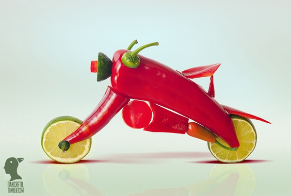
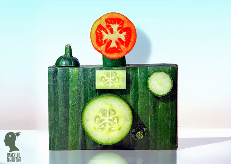
Dan Cretu-
Dan Cretu is a Romanian Photographer works in the advertising industry and builds sculptures of everyday objects that are bright, fun, colourful and are all made out of food. His work has seen him transform citrus fruit into bicycles, bacon into chewing gum and cabbages into human brains.
Cretu says that he finds inspiration in everything but aims to challenge himself by turning an unlikely object into something else entirely.
He says: 'All objects and things around us daily are possible subjects for me.”
The challenge is to transform a common object that we don't notice anymore into something unusual, alive, and appealing.'
The result of Cretu's works is a vivid and colourful collection of photographs which he says are not digitally altered whatsoever.
Dan cretu's work-
|
|

|
Favorite picture- |
Least favorite picture- |

|

|
|
I like this piece because of how he assembles the popcorn to look like a person face, In my opinion Dan Cretu's work is playful and imaginative. Also the plain blue background makes the red and white stripes on the bucket stand out and blend together effectively. I also think that the coke bottle was a nice effect too.
The focus point is on the center of the image. Dan hasn't used any unique angles to take this photo but it still looks creative. Also this piece has a correct exposure I know this because the picture isn't too dark, or too light. When I look at this piece I feel childish because it makes you imagine a ' living popcorn man'. It looks as if she may have used the white balance because the appears to be more a white lighting than yellow. |
I least like this photo because in my opinion this isn't really Cretu's style of work he usually uses bright colours and and interesting textures to assemble his work but this picture is rather dull and plain however I do like the black stripes on banana.
|
Justine Khamara-
Justine Khamara is an artists who meticulously builds two-dimensional photographs into three-dimensional sculptures, often transforming figurative images into complex abstract forms. In Stratum, Khamara works only on paper that appear as optical Illusional art . Bands of black and white are repetitiously repeated- stacked and
interrupted to create collages.
interrupted to create collages.
Justine Khamara's work-

|

|

|
Michael Mapes-
Hair colour, eye colour and fingerprints make up what Michael Mapes describes as the “biographical DNA” used in creating each of his reinterpretations of the Dutch Masters' portraits. “I think about constructing the work in a painterly sense,” says Mapes. “Each specimen is like a paintbrush stroke” In reconstructing each portrait, hundreds of different prints and photographs of the source material are reused and resized.
Michael Mape's work-

|

|

|
Test Shoot-
The plan-
|

|
For my test shoot I will take pictures of jewels linking my work to one of Ira Garber's jewel pictures and I will change the pattern of the jewels and take pictures at different angles such as birds eye view and a low angle view.


Edited-
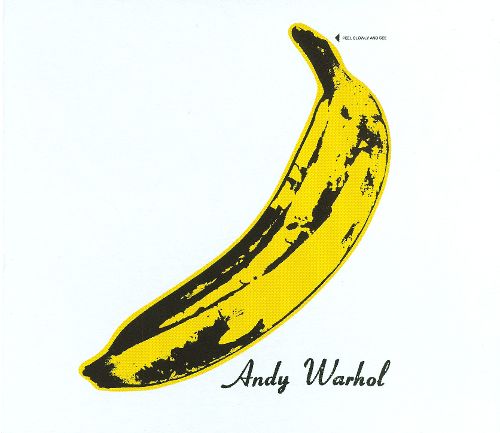
Andy Warhol-
Warhol was an US painter, film-maker and author, and a leading figure in the Pop Art movement. In Andy Warhols eariler career he worked in advertising for magazines similar to Catherine Losing. Andy Warhol was facinated with the idea of fame and making everyday objects art he would often use food items or packaging within he screen prints.
|

|
Test Shoot-
The Plan-
|

|

|
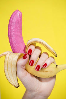
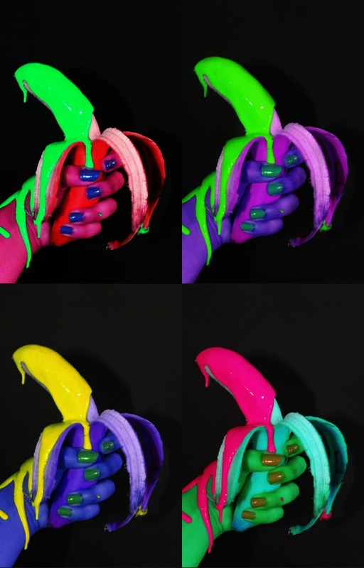
For my first exam shoot, I intend on doing a practical shoot. My idea is to take a photo of me holding a banana against a black background, then pour blue pain over the banana so the colours can clash. Also I may add sequins or glitter to make it look more creative. Then on photo-shop I will link my work back to Andy Warhol's and make a collage changing the colours on the pictures. I was inspired by Andy Warhol's art and decided to link his art with my work.


Edited-


My First Exam Shoot-
The Plan-

|

|

|
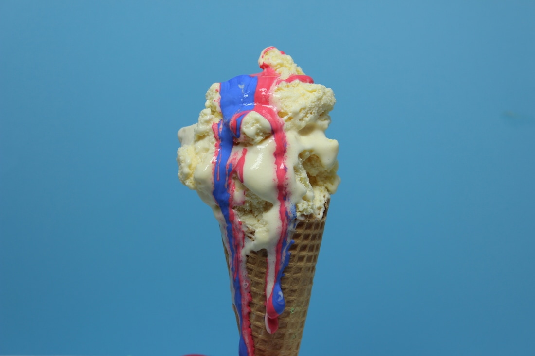
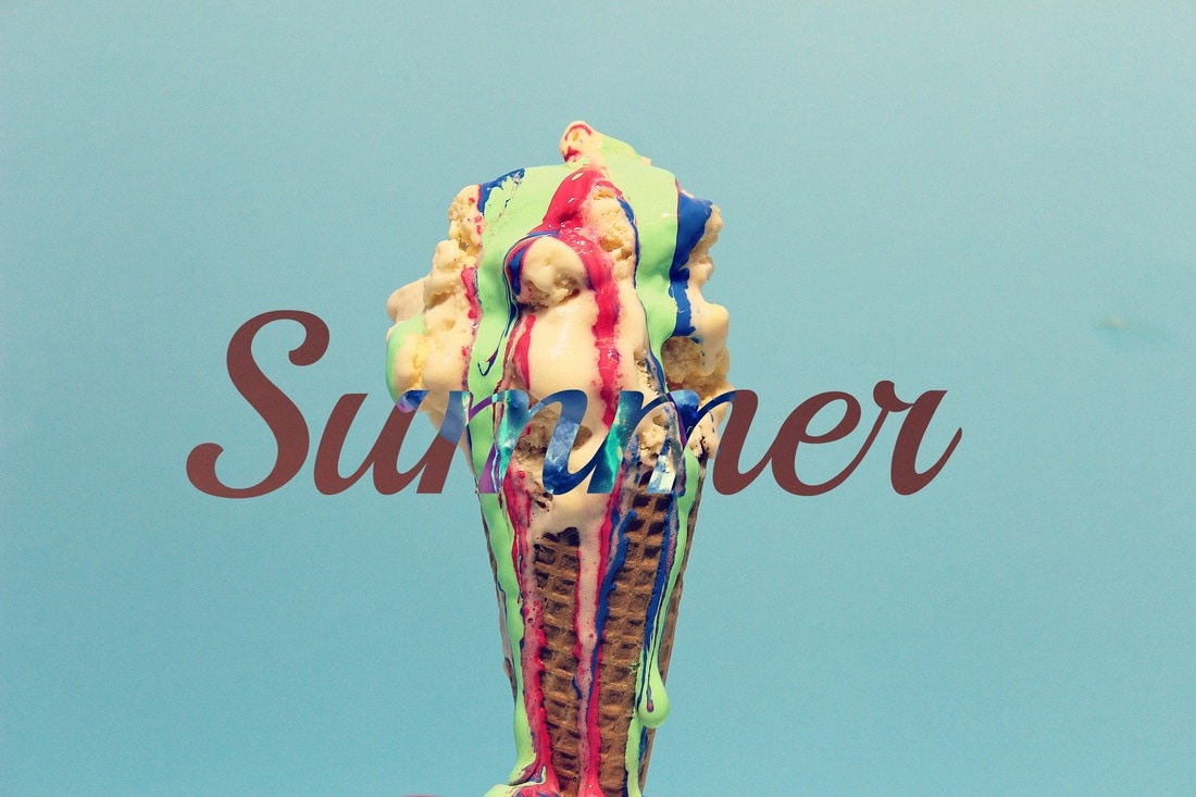
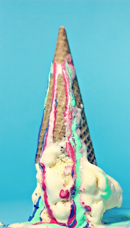
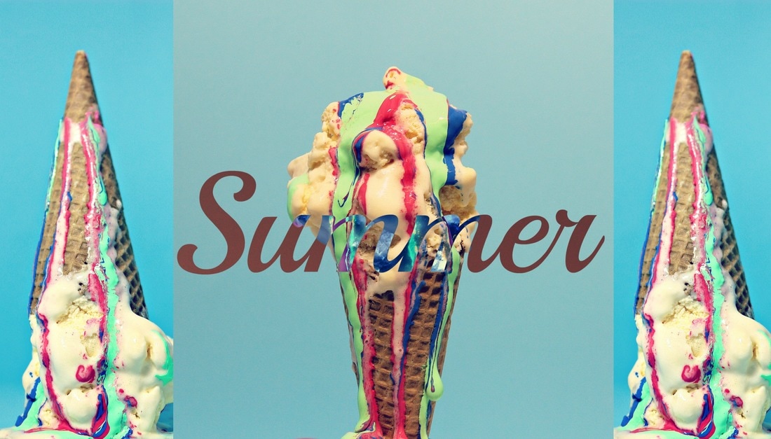
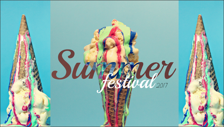
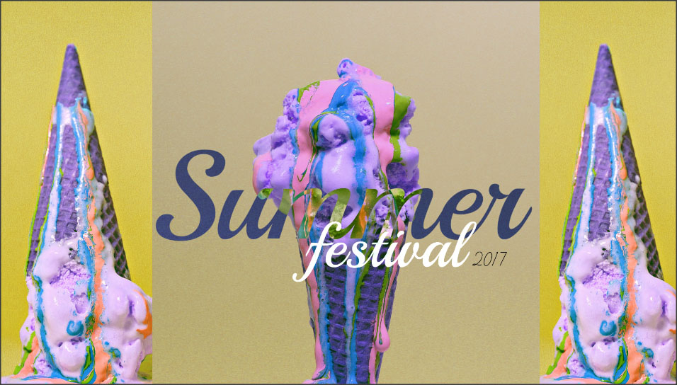
On this shoot, I intend to complete a practical photo-shoot and then use Photoshop. My plan is to arrange ice-cream cones and then take photos rearranging them and also taking photos at different angles so it creates different lighting effects and changing the look of the image. After that my idea was to create a poster advertising a Summer party or festival using the images I did on my shoot. I was inspired by Catherine Losing and Andy Warhol because they both worked for magazines and made adverts


Edited-
Final Exam Shoot-
The Plan-

|

|
|
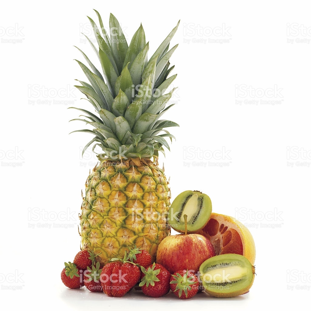
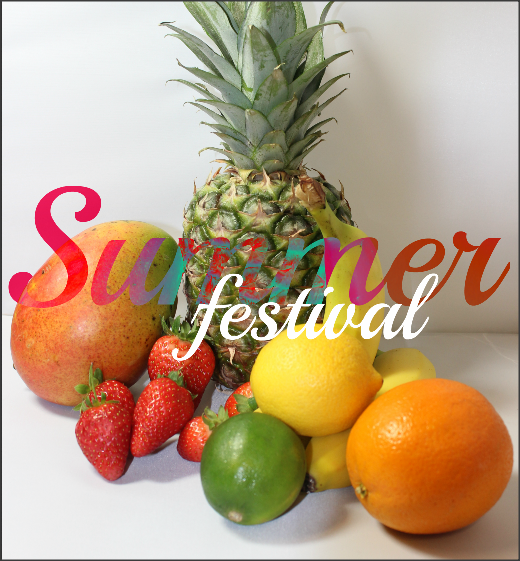
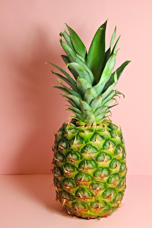
On my last exam session, I intend to complete a practical photo-shoot and then use Photoshop. Similar to my ice-cream shoot, my plan is to arrange a variety of tropical fruits and take photos rearranging the them and also taking photos at different angles so it creates different lighting effects and changing the look of the image. After that my idea was to create a poster advertising a Summer party or festival using the images I did on my shoot.


Best picture- |
Worst picture- |
Edited-

|
|


|

For this image I linked my work with Catherine Losing by using pastel colours like she does. I like this image because the colours are not vibrant yet the image still stands out.
|


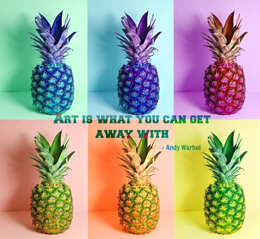
For this final edit I decided to link my work back to Andy Warhol with the collage of different coloured pineapples. I also added a famous quote of Andy Warhol's to keep the link with this work. What I like about this image is how colorful it is and also the shadow on the left hand side of the pineapple was a nice affect too.
